Booking Experience Unification

Egencia, corporate travel from Expedia Group, is reimagining business travel management to make business travelers happier and corporate travel programs more successful. Egencia offers more personalized experiences through curated access to the world’s most relevant travel options.

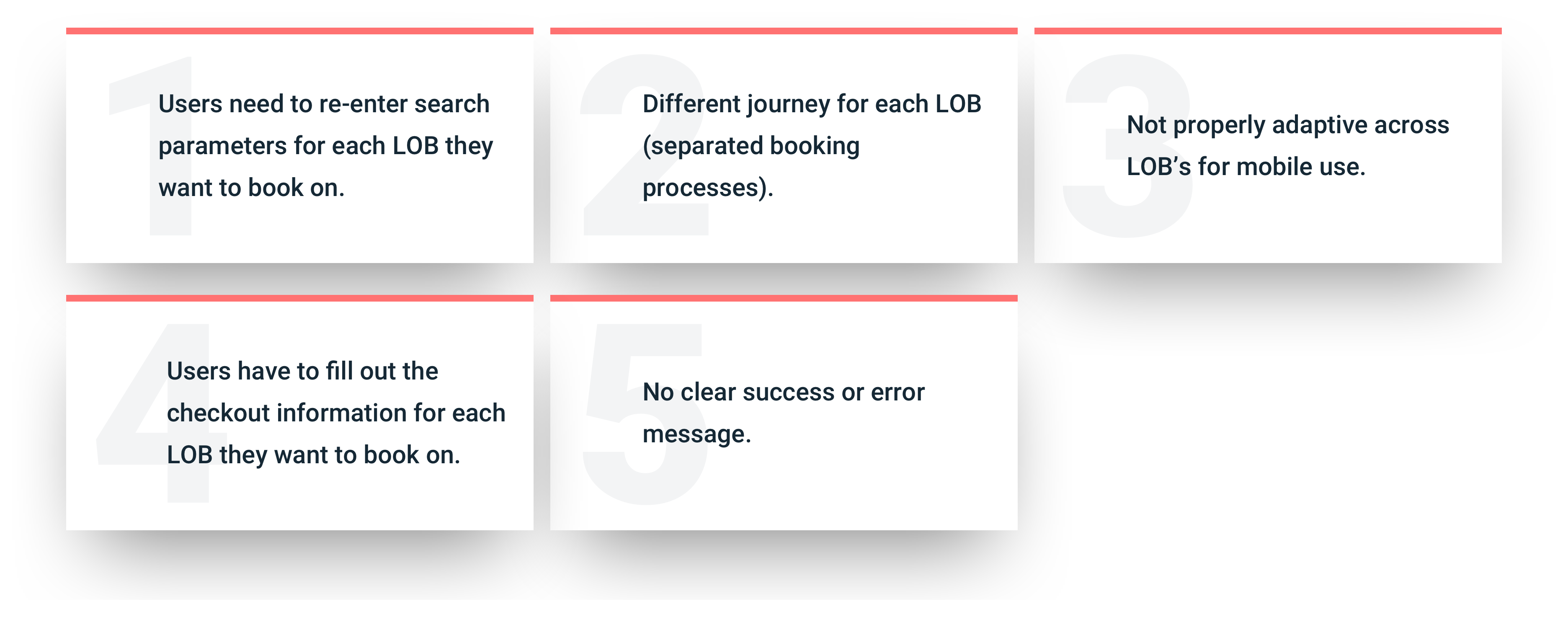
Friction Points

We’ve conducted several interviews to gather feedback on the current product quality.

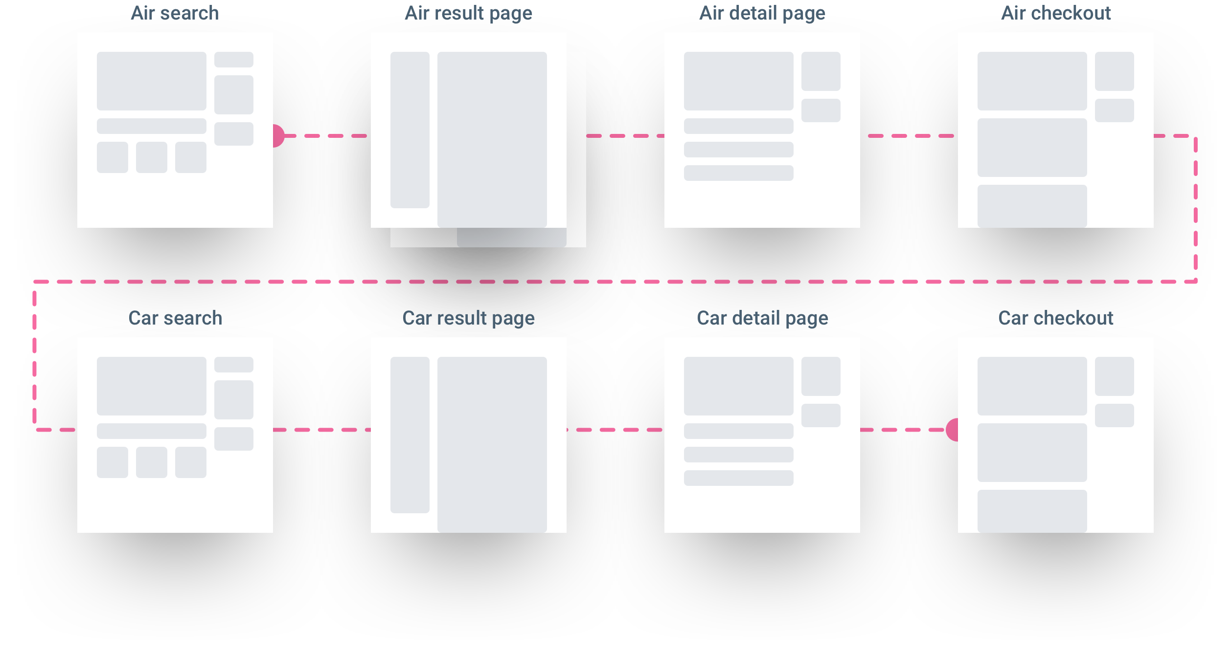
User Journey

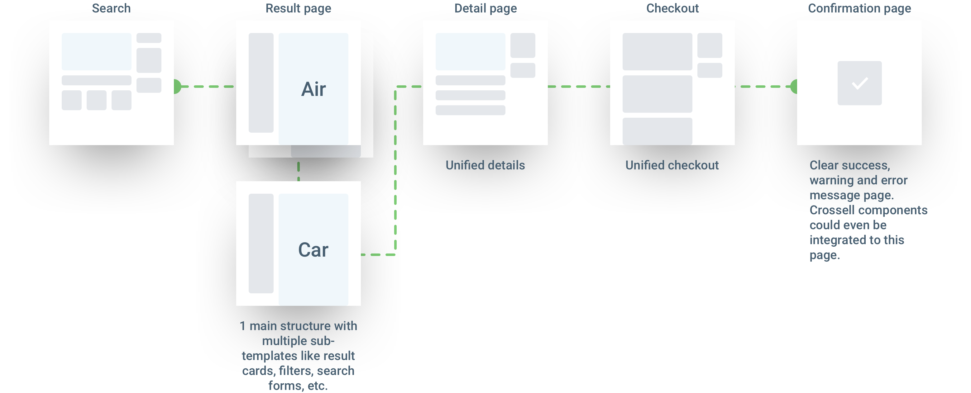
The current booking flow isn’t designed to handle cross-product bookings. Ex: if a user wants to book a flight and rent a car, he currently has to go over the entire booking flow TWICE.

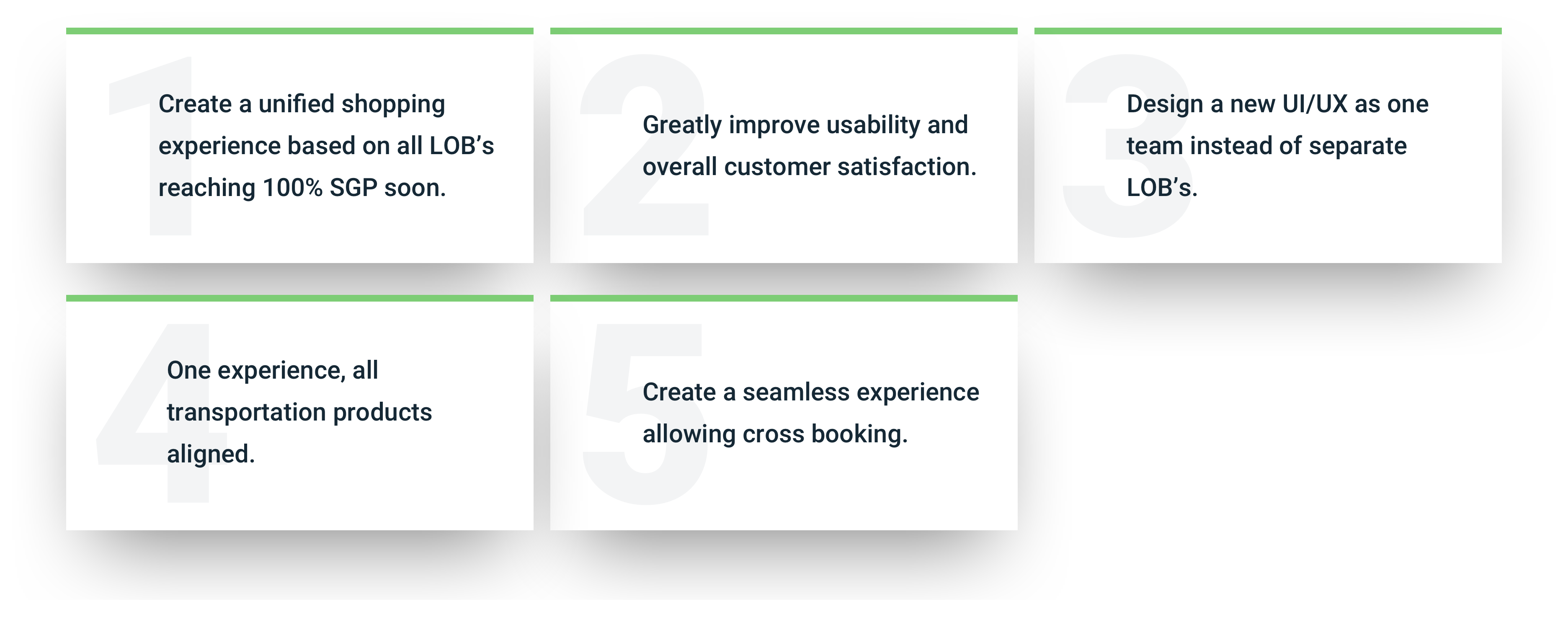
Opportunities

We want to use this opportunity to make our platform evolve. 

New User Journey

Based on gathered feedback we are now able to give our first recommendation on what could be the future booking flow. Users should have one global experience with common UX patterns.

Past Experiences

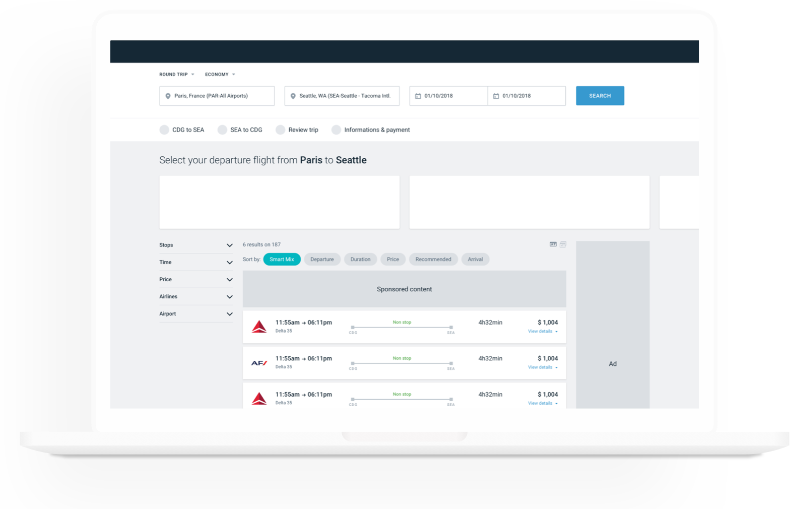
Unifying our page and layout design

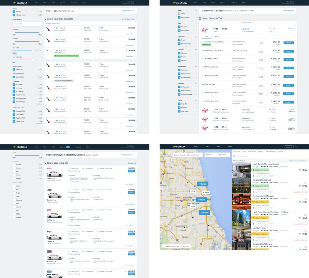
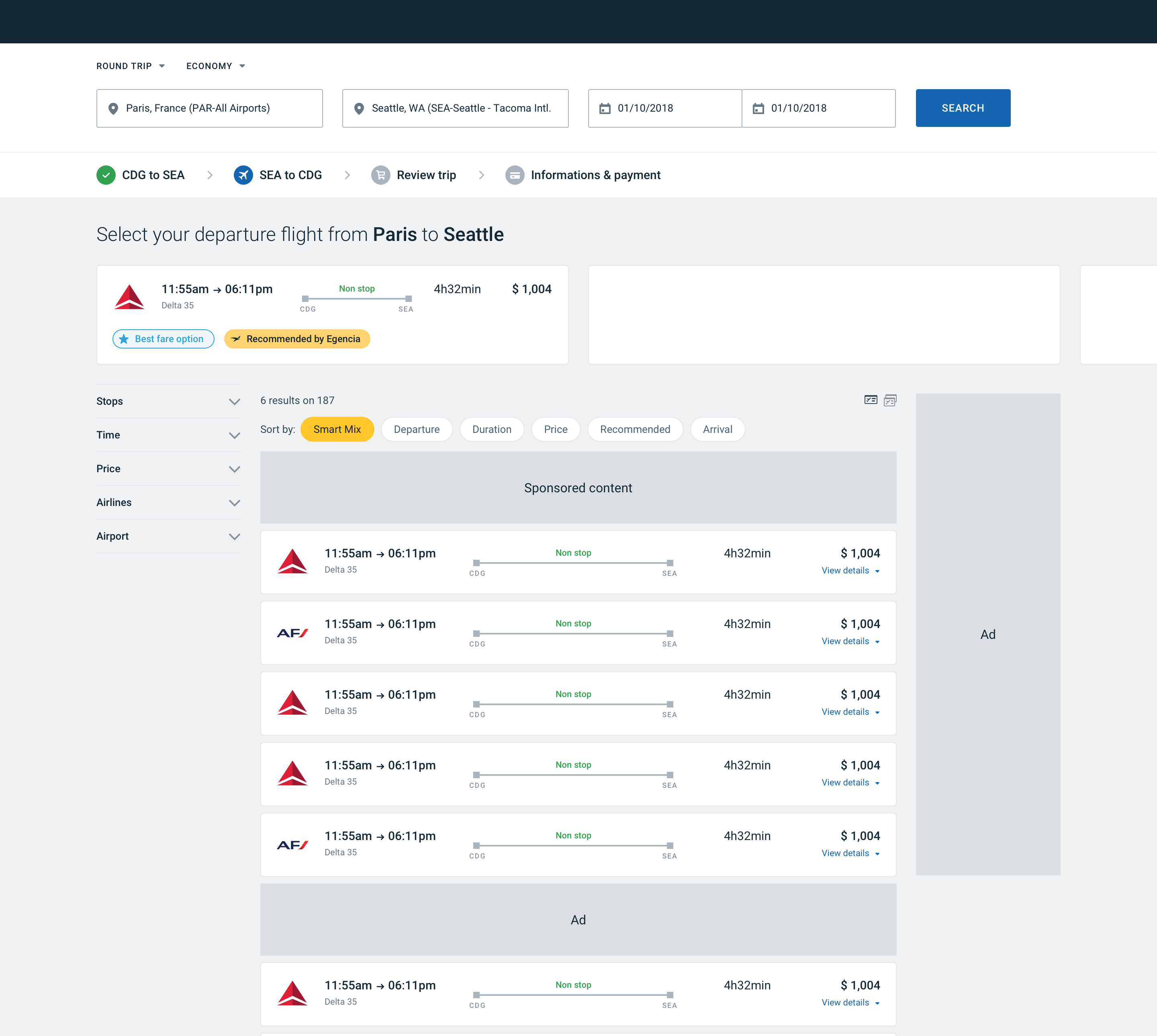
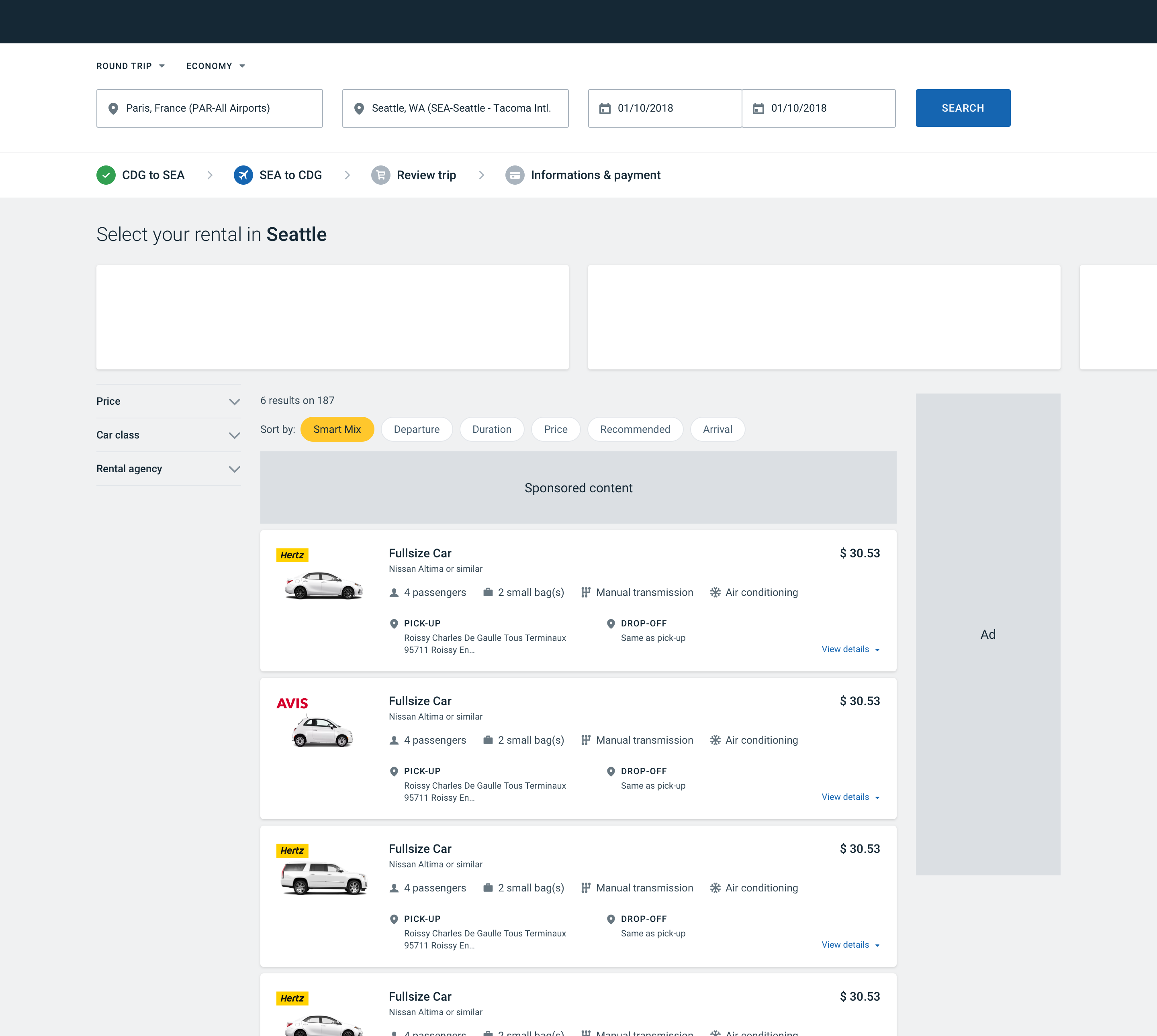
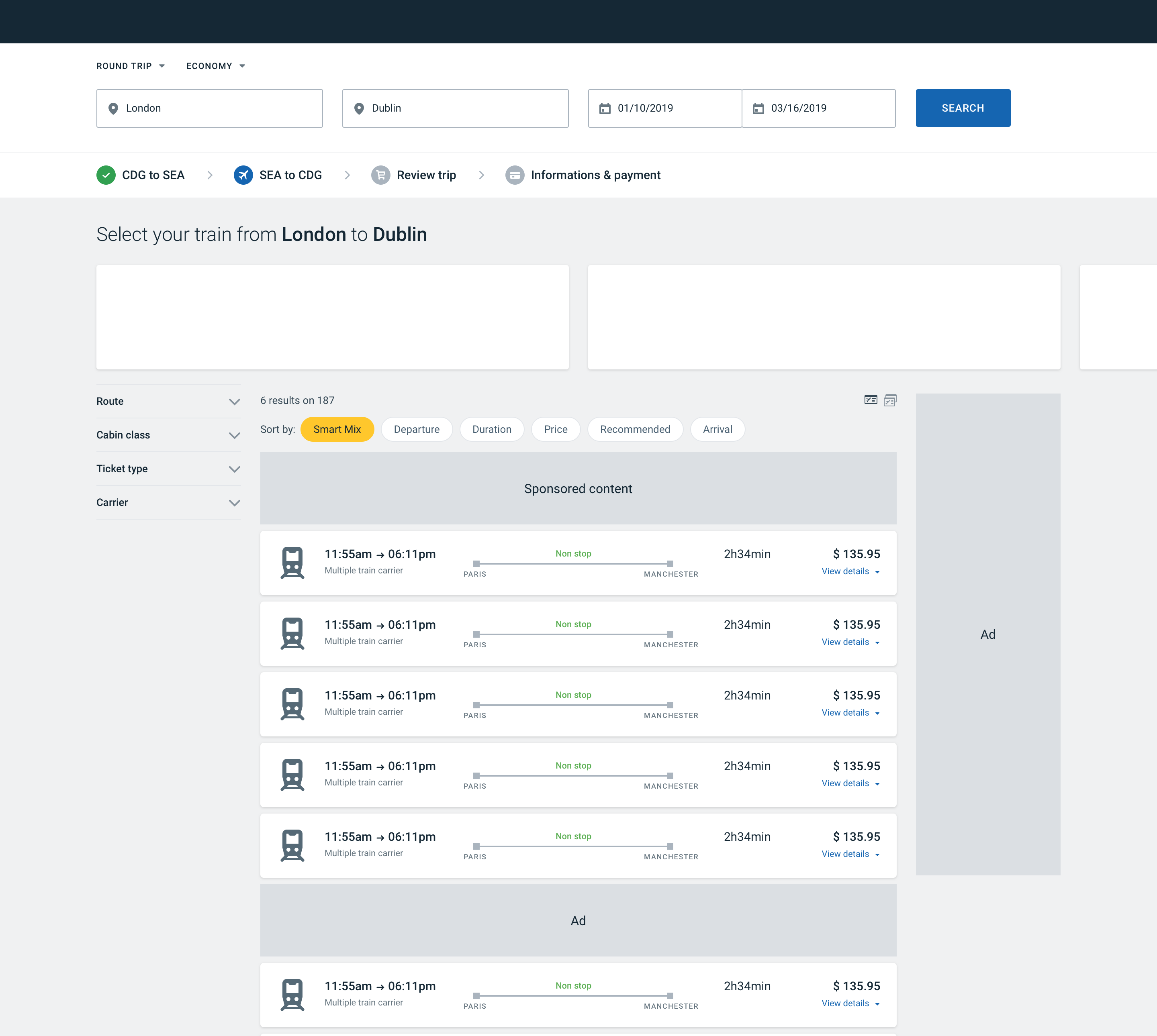
Components shared within the product (such as filters, search bars, etc.) and their placement, was optimized while working closely with the transportation teams in Paris. With their help, we conducted A/B tests of these new patterns from which all parts of the product can benefit. The aim is to apply the resulting knowledge globally.

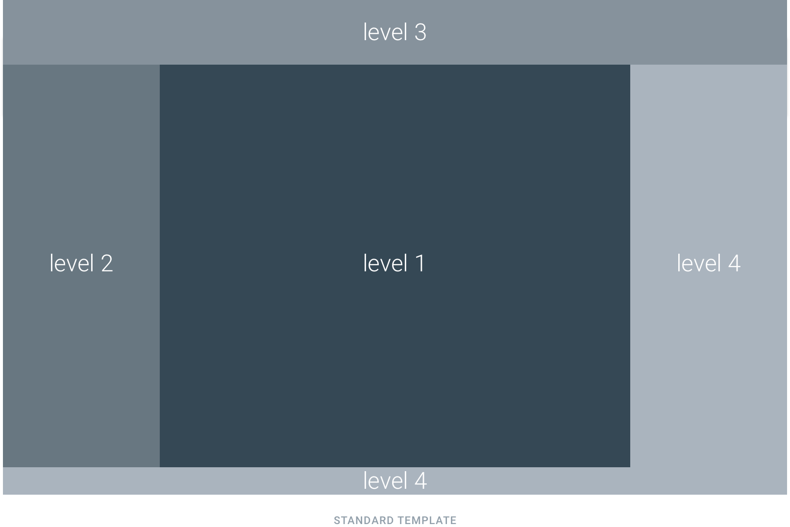
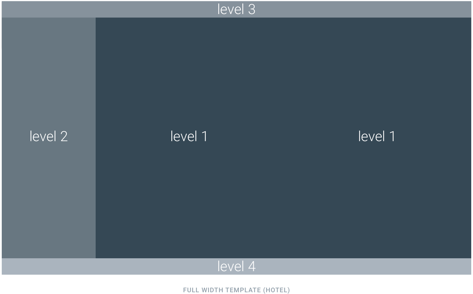
Consistency resides on display rules you apply to components. In the case of the result cards, we have defined 3 levels of information importance.

• Level 1 area contains the result area

• Level 2 area is dedicated to filtering components

• Level 3 area contains the search options and breadcrumb navigation. This area can also contain display options

• Level 4 areas are dedicated to the information that doesn’t impact the booking (ads or contextual help)

Two layouts are available. Layouts are chosen based on the components need (ex: hotel map)

Result Cards Mapping

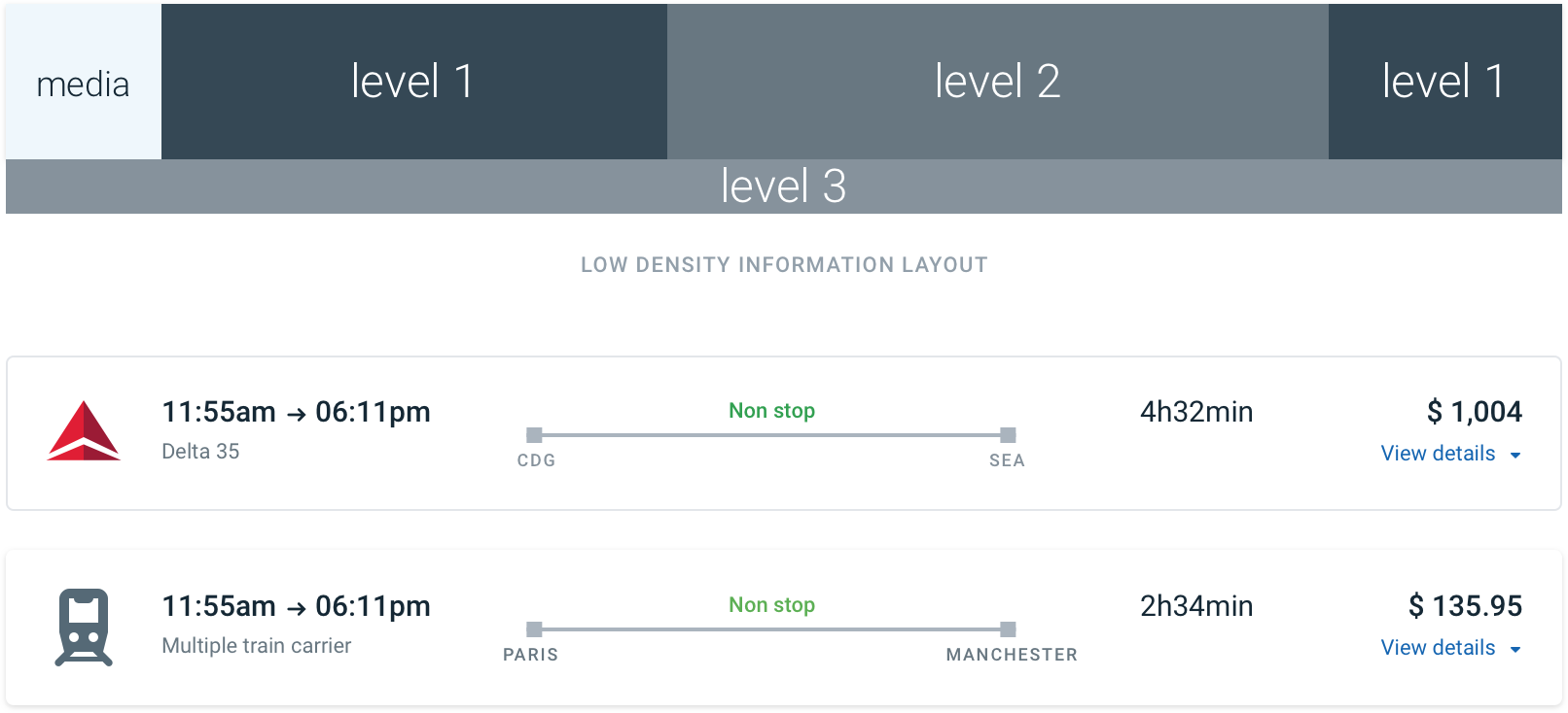
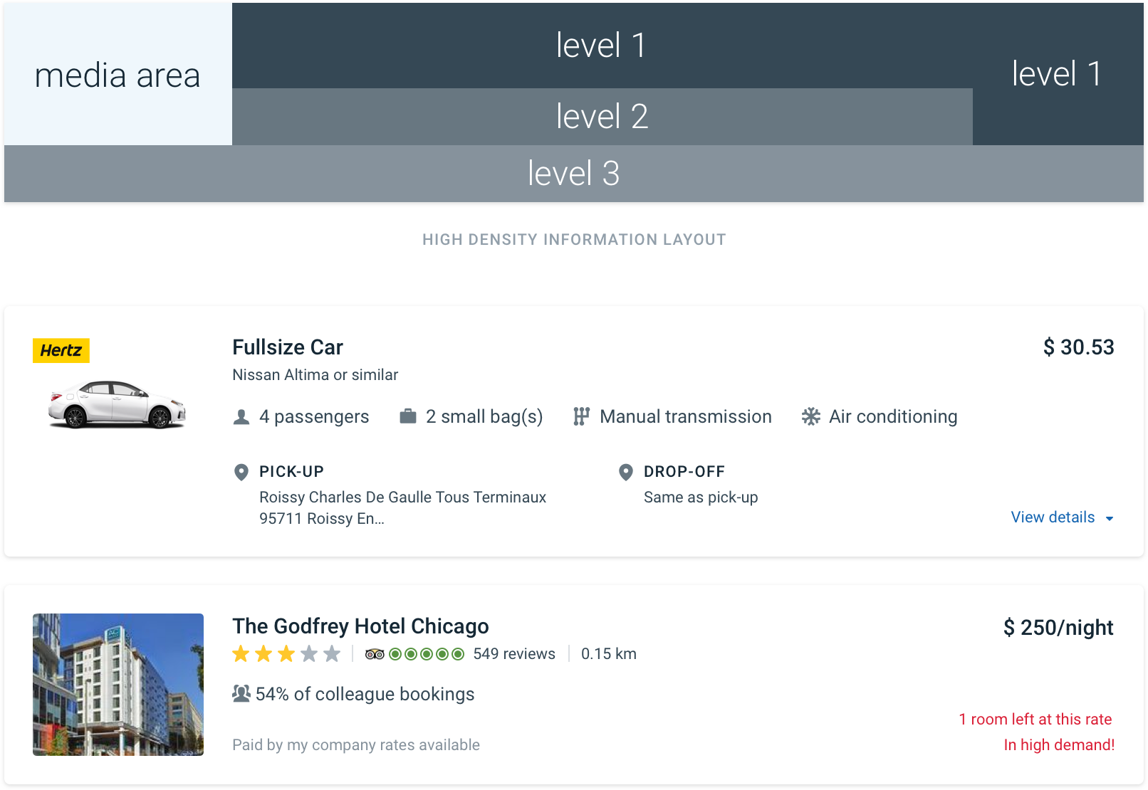
Consistency resides on display rules applied to the component. In the case of the result cards, we have defined 3 levels of information importance.

• Level 1 areas are used to display only proprietary information such as time and price.

• Level 2 area should contain “deal-breaker” information like stops, duration, or amenities that directly influence the user’s choice.

• Level 3 area contains variable information like tags or non-important information. This area shouldn’t be displayed if empty.

Two layouts are available. The layout is chosen based on the density of information needed in the main card area.

The Result

Consistency resides on display rules applied to the component. In the case of the result cards, we have defined 3 levels of information importance.

• Level 1 areas are used to display only proprietary information such as time and price.

• Level 2 area should contain “deal-breaker” information like stops, duration, or amenities that directly influence the user’s choice.

• Level 3 area contains variable information like tags or non-important information. This area shouldn’t be displayed if empty.

Two layouts are available. The layout is chosen based on the density of information needed in the main card area.

5

Variations tested

95/100

Usability score

+$40M

Estimated revenue